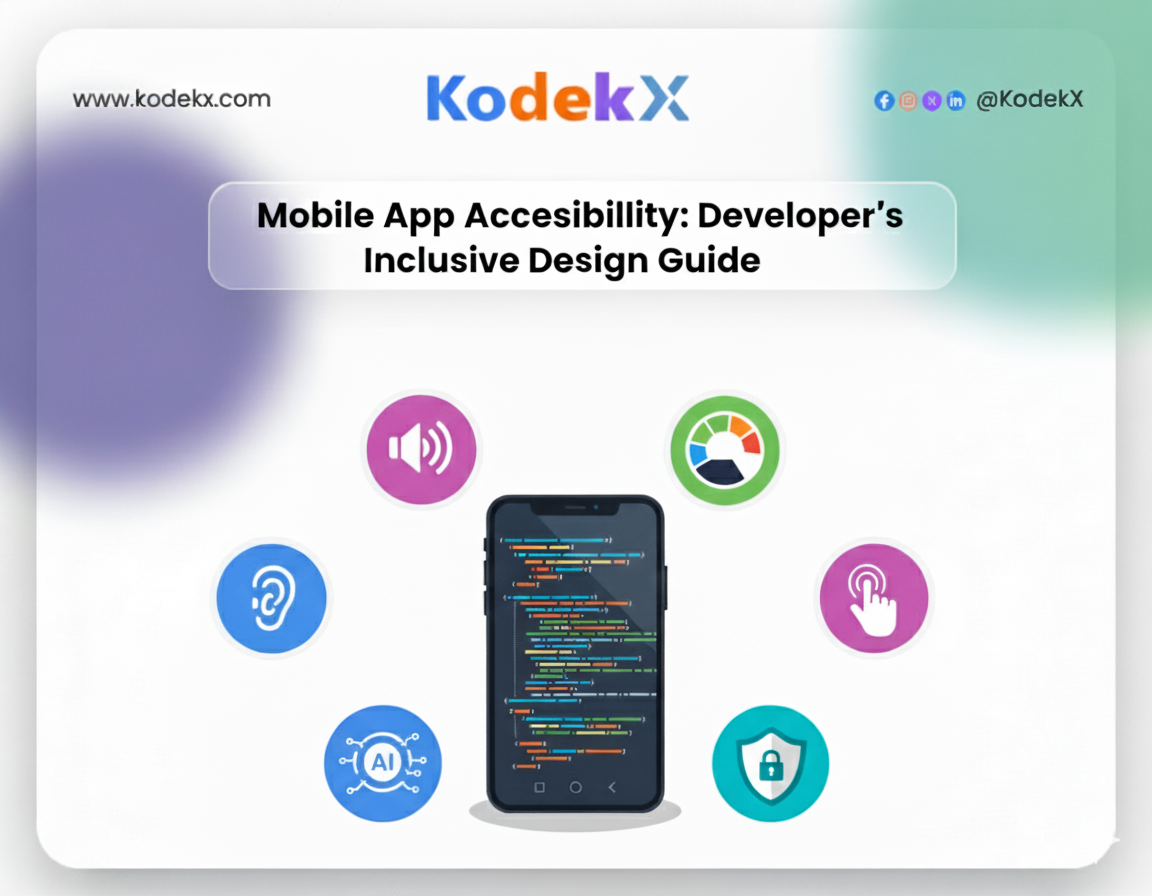
Guide to Mobile App Accessibility Standards
Mobile apps development are now a primary way people access services, information, and entertainment. But what happens when an app doesn’t consider users with disabilities? Many apps fail to serve a significant portion of the population. Accessibility isn’t just about compliance—it’s about inclusive design, improving user experience, and opening your app to a wider audience.
Globally, 1.3 billion people, or 16% of the population, experience significant disabilities. In the U.S., over 70 million adults have reported disabilities, and with 310 million smartphone users, inaccessible apps exclude millions of potential users. Accessibility ensures your app is usable for all users, regardless of ability, while aligning with ADA Compliance, WCAG, and other legal requirements.
What Is Mobile App Accessibility?
Mobile app accessibility ensures that apps are usable by people with diverse abilities, including visual, auditory, cognitive, and motor impairments. Accessibility involves:
- Perceivable content:Making sure users can see, hear, or otherwise perceive information.
- Operable interfaces: Users can navigate and interact easily.
- Understandable design: Content and navigation are easy to comprehend.
- Robust compatibility: Works with assistive technologies like screen readers, magnifiers, and voice commands.
Example: A grocery delivery app that provides alt text for images, proper labeling for buttons, and voice input for search makes shopping possible for a visually impaired user, while also improving usability for someone using the app in bright sunlight.
Instances When Mobile App Accessibility Is a Legal Requirement
Accessibility isn’t optional when certain conditions are met:
- Apps linked to physical stores or services open to the public.
- Apps that provide essential services accessible only via mobile.
- Apps used by federal employees or government agencies.
- Apps offering communication or emergency services.
Ignoring accessibility can result in lawsuits, fines, and reputational damage. For instance, Domino’s Pizza faced ADA lawsuits due to inaccessible mobile platforms.
Regulations and Guidelines for Mobile Apps
ADA Compliance for Mobile Apps
The Americans with Disabilities Act requires digital platforms to be accessible, ensuring users with disabilities can perform the same actions as other users. ADA compliance affects:
- Navigation and touch targets
- Color contrast
- Screen reader compatibility
- Text alternatives for non-text content
WCAG for Mobile Apps
The Web Content Accessibility Guidelines (WCAG) by W3C provide internationally recognized standards. Key principles include:
- Adjustable fonts and text scaling
- High color contrast
- Semantic labeling for elements
- Logical navigation order
- Responsive design across devices
Compliance ensures your app is inclusive and minimizes legal risk.
How To Design Accessible Mobile Apps
Designing mobile apps with accessibility in mind ensures that all users, regardless of ability, can navigate, interact, and consume content effectively. Accessibility is not just about compliance with laws or guidelines like ADA Compliance or WCAG; it’s about creating a seamless, inclusive user experience that benefits everyone. Below are key strategies for building accessible mobile apps.
Design for Different Screen Sizes
Mobile devices come in a variety of sizes, resolutions, and aspect ratios—from small smartphones to large tablets and even foldable devices. If an app isn’t designed to adapt, content may become unreadable, touch targets may be too small, or layout elements may overlap, making it unusable.
Using responsive design frameworks ensures your app scales fluidly across devices. For instance, adopting flexible grids, Scalable React images, and dynamic text sizing allows content to adapt without losing structure.
Example: A social media app that dynamically scales images, text, and buttons based on device orientation improves usability for both smartphones and tablets. A post that fits perfectly on a vertical smartphone screen should seamlessly expand for a horizontal tablet display without hiding key information or functionality.
Testing across multiple devices and screen sizes is critical. Simulators, real devices, and responsive design testing tools help identify layout issues before your app reaches users.
Have a Consistent Layout
Predictable and consistent layouts are essential for reducing cognitive load and guiding users efficiently. Users learn patterns and develop expectations; when layouts vary wildly between screens, it becomes confusing and frustrating.
Navigation bars, menu structures, and button placement should remain uniform throughout the app. For example, a messaging app that keeps the “Compose” button in the bottom-right corner on every screen allows users to locate and interact with it quickly without having to reorient themselves on each page.
Reusable templates for different screens not only improve development efficiency but also make the app more predictable, which benefits users with cognitive disabilities or memory challenges.
Provide Color Contrast
Color contrast plays a pivotal role in readability and visual clarity. Low contrast can make text or UI elements invisible to users with visual impairments or color blindness.
Maintain a high contrast ratio—the WCAG recommends at least 4.5:1 for standard text and 3:1 for large text. Use contrast testing tools to ensure that foreground and background colors meet accessibility standards.
Example: An error message displayed in bright red should also include an icon (like an exclamation mark) and clear text such as “Form incomplete” to communicate the issue effectively to all users. This approach ensures that color isn’t the sole method of conveying critical information.
Use Labels
Labels are critical for guiding users, particularly those relying on screen readers. Vague instructions like “Click Here” or “Submit” without context are confusing. Descriptive labels provide clarity and purpose for every interactive element.
Example: Instead of labeling a payment button as “Submit,” use “Submit Payment” so that screen readers can clearly communicate the action. Similarly, form fields should have clear labels like “Enter your email address” rather than just “Email,” ensuring users understand exactly what is required.
Semantic HTML elements and accessibility attributes (like ARIA labels) help assistive technologies interpret the interface correctly. Proper labeling enhances both accessibility and overall usability.
Pay Attention To Touch Targets
Touch targets—buttons, icons, and interactive elements—must be large enough and spaced adequately to avoid accidental taps. The recommended minimum size is 44x44 pixels, but increasing size can further improve accessibility for users with motor impairments, tremors, or limited dexterity.
Placement matters too. Frequently used buttons should be positioned within comfortable thumb reach, especially for one-handed use. Crowded buttons or poorly spaced icons can cause user frustration and errors.
Example: On a banking app, placing “Transfer” and “Cancel” buttons too close together could result in accidental transactions. Adequate spacing and large touch targets prevent such errors and make the app more inclusive and user-friendly.
Provide Image Alternatives
Images convey essential information, but users with visual impairments rely on alternative text (alt text) to understand image content. Every image in your app should include descriptive alt text that explains its content and purpose.
Avoid using images of text because screen readers cannot interpret them. Instead, provide text directly in the UI or as alt text. Label all form controls for screen readers so users can understand their purpose.
Example: A product image in an Optimization for Optimization for E-commerce app should include a description like: “Red cotton t-shirt with short sleeves and crew neck.” For buttons with icons, provide alt text such as “Add to Cart” or “Search.” This ensures that users with visual impairments can navigate and interact with your app effectively.
Providing image alternatives benefits all users. Even users with good vision may access your app in bright sunlight, on low-resolution screens, or in environments where images cannot load properly. Alt text guarantees that no one misses crucial information.
Why Mobile App Accessibility Is Unique
Mobile apps differ from websites:
- Heavy reliance on gestures
- Varying screen sizes and orientations
- Touch interactions and haptic feedback
- Limited screen real estate
These factors create unique challenges for users with disabilities, making inclusive design critical for mobile apps.
Mobile App Accessibility and Lawsuits
Accessibility failures can result in high-profile legal challenges. Examples include:
- Domino’s Pizza: ADA lawsuit due to inaccessible mobile app.
- Banks and financial services: risk lawsuits for poor screen reader support.
Accessible design is not just ethical—it protects your brand and ensures compliance.
The Mobile App Accessibility 6-Step Checklist
1. Design for Varying Screen Sizes
Mobile devices come in all shapes and sizes, from compact smartphones to large tablets and foldable phones. Designing for a single screen size can lead to distorted layouts, hidden content, or small touch targets that frustrate users.
Responsive layouts adjust automatically to fit different screen dimensions. For example, a news app might display a three-column layout on tablets but switch to a single-column scrollable view on smartphones. Foldable devices introduce additional challenges—content must adapt when the screen unfolds or folds without breaking the layout.
Testing content scaling and readability is crucial. Ensure that text remains legible when zoomed in, images scale properly without distortion, and buttons remain easily tappable. Using responsive frameworks like Flutter, React Native, or SwiftUI can simplify this process and ensure a seamless experience across devices.
2. Focus on Touch Targets and Placement
Touch targets—the buttons, icons, and interactive elements in your app—must be large enough to tap easily and spaced to prevent accidental presses. The minimum recommended size is 44x44 pixels, but larger is often better for users with motor impairments or dexterity issues.
Placement is equally important. Frequently used buttons, like “Submit” or “Next,” should be within thumb reach, especially for one-handed use. For instance, a messaging app’s “Send” button is often placed near the bottom-right corner for ergonomic access.
Spacing matters too. Crowded buttons can confuse users and increase errors. Consider a banking app: accidentally pressing “Transfer $100” instead of “Transfer $10” could have serious consequences. Thoughtful touch target design ensures safety, accuracy, and a smoother user experience.
3. Keep Device Gestures Simple and Provide Feedback
Gestures like swipes, pinches, or long presses enhance interactivity, but complex gestures can create accessibility barriers. Users with motor impairments or certain cognitive challenges may struggle with multi-finger or precise gestures.
Provide alternatives to complex gestures. For example, if an app uses a two-finger swipe to archive an email, also allow a simple tap or button press to achieve the same action.
Feedback is essential. Users need confirmation that their action was recognized. Use haptic feedback (vibration) or visual cues (color changes, checkmarks, or progress bars) to indicate successful interactions. For example, a form submission could trigger a green checkmark animation along with a subtle vibration to reassure the user. Feedback enhances confidence and usability, particularly for users relying on assistive technology.
4. Ensure Consistent Layouts and Templates
Consistency across screens reduces cognitive load and helps users navigate intuitively. When menus, buttons, and other interactive elements appear in predictable locations, users can learn the interface faster and avoid frustration.
For example, a shopping app may keep the main navigation bar at the bottom of the screen on every page. Product cards, checkout buttons, and search bars should follow the same style and placement patterns across different sections.
Reusable templates are not only efficient for developers but also create a coherent experience for users. Consistent layouts improve accessibility for people with cognitive disabilities, who may rely on familiarity to interact confidently with the app.
5. Provide Easy Methods for Data Entry
Typing on a small screen can be challenging for users with motor impairments, cognitive challenges, or even those simply on the move. Minimizing typing requirements and providing alternative input methods improves accessibility.
Support voice input, autofill, predictive text, and barcode or QR scanning whenever possible. For example, an e-commerce checkout form could allow users to scan their credit card instead of typing 16-digit numbers manually. Similarly, a contact form could pull information automatically from stored profiles.
Simplifying data entry reduces errors, speeds up processes, and ensures users of all abilities can complete tasks efficiently. It also improves overall user satisfaction and retention.
6. Double-Check Color Contrast
Color contrast is a critical aspect of accessibility. Low contrast between text and background can make content unreadable for users with visual impairments, including color blindness.
Use tools like Contrast Checker or built-in accessibility tools in Xcode and Android Studio to measure your color ratios. WCAG recommends a minimum contrast ratio of 4.5:1 for normal text and 3:1 for large text.
Avoid using color as the only means to convey information. For example, if an error message is highlighted in red, include an icon or text label like “Form incomplete” to ensure all users understand the issue. Testing your color palette across various devices and lighting conditions ensures readability for all users.
Achieving Accessible Mobile App Design and Development
Understanding Mobile Accessibility at W3C
W3C emphasizes four principles:
- Perceivable Content: Info must be available visually or audibly.
- Operable UI: Navigation and interaction must be smooth.
- Understandable Content: Language must be clear.
- Robust Compatibility:Works with assistive technology.
When Should a Mobile App Be Accessible?
Accessibility is critical if your app:
- Connects to a physical store
- Is the sole online access point for a service
- Is used by government employees
- Offers essential communication tools
Common Mobile App Accessibility Barriers
- Poor screen reader support
- Low color contrast and small text
- Inaccessible touch targets
- Motion sensitivity issues (flashing content)
- Audio/video barriers without captions or transcripts
- CAPTCHA challenges without alternatives
WCAG Principles for Mobile App Accessibility
- Consider different screen sizes
- Ensure high color contrast
- Simplify gestures and interactions
- Adjust tap targets
- Make data entry easy
- Keep layouts consistent
Mobile App Accessibility Testing
Manual Mobile App Testing Guidelines
- Verify screen reader compatibility
- Check touch targets, gestures, and spacing
- Test font size and color contrast
- Include users with disabilities in beta testing
Automated Tools
- iOS: VoiceOver, Accessibility Inspector
- Android: TalkBack, Accessibility Scanner
- Cross-platform: Axe, Lighthouse, Sofy
A Mobile App Developer’s Checklist for Inclusive Design
1. Screen Reader Compatibility & Navigation
- Clear labels for all interactive elements
- Alt text for non-text content
- Semantic widgets for meaningful interpretation
2. Keyboard & Switch Navigation
- Full operability via external devices
- Logical focus order for intuitive navigation
3. Color and Contrast
- Maintain high contrast (minimum 4.5:1)
- Avoid using color as the sole information source
4. Touch Targets and Gestures
- Minimum target size: 44x44 pixels
- Sufficient spacing between targets
- Alternative methods for complex gestures
5. Navigation and Layout
- Consistent navigation patterns
- Support landscape and portrait orientations
6. Language and Content
- Clear, jargon-free language
- Adjustable text sizes
- Non-flashing content
7. Testing and Feedback
- Test with assistive technologies
- Collect user feedback
- Use automated tools to identify issues
Emerging Trends in Mobile Accessibility
- AI-Powered Accessibility: Automatic captions, predictive adjustments, personalized interfaces
- Accessibility in VR and AR: Gestures, spatial navigation, and auditory cues must be inclusive
Key Takeaways
- Accessibility is crucial for compliance, user satisfaction, and broader reach
- WCAG, ADA, and EAA standards guide design and implementation
- Inclusive design benefits all users, not just those with disabilities
- Regular testing, both manual and automated, ensures apps meet accessibility standards
Final Thoughts
Creating a mobile app that is truly accessible is more than just a compliance checklist—it’s a commitment to inclusive design and a better user experience for everyone. With 1.3 billion people worldwide experiencing significant disabilities, and millions of smartphone users in the U.S. alone, the need for ADA-compliant, WCAG-aligned, and universally usable apps has never been more urgent.
By following a structured approach—focusing on screen reader compatibility, touch targets, color contrast, responsive layouts, clear labeling, and robust accessibility testing—developers can ensure their apps are usable, enjoyable, and legally compliant. Integrating AI-powered accessibility features and keeping up with emerging trends in AR, VR, and mobile gestures further enhances inclusivity and innovation.
Ultimately, accessible mobile apps aren’t just about following rules—they’re about empowering users of all abilities, expanding your audience, reducing legal Risks, Exploits , and building loyalty through thoughtful, user-centric design. Every step you take toward accessibility transforms your app into a more inclusive, reliable, and future-proof digital experience.
Ensure Your App Is Accessible
Follow best practices to create inclusive apps quickly.
Frequently Asked Questions
Designing apps so users with diverse abilities—including visual, auditory, motor, and cognitive impairments—can navigate, interact, and access content effectively. It ensures a seamless and inclusive experience for everyone.
To make apps usable for all users, comply with regulations like ADA and WCAG, and enhance overall usability, satisfaction, and audience reach. Accessible apps also reduce legal risks and improve brand reputation.
By using screen readers, automated testing tools, manual evaluation, and gathering feedback directly from users with disabilities to identify and fix accessibility issues.
Issues such as low color contrast, poor screen reader support, small or inaccessible touch targets, motion sensitivity problems, and missing captions for multimedia content.
Tools include VoiceOver, TalkBack, Accessibility Inspector, Axe, Lighthouse, Sofy, and direct user testing to ensure all accessibility guidelines are met across platforms.